Data Series MOD009DH6
Access
Customizer → Layout Objects → Charts →Chart Configurations by Work Area → Click on the link of the required chart to open the Chart Customizer→
 Data Series
Customizer → Layout Objects → Charts → Chart Configurations Direct Editing → Click on the link of the required chart to open the Chart Customizer →
Data SeriesOpen the required user module → Click on the button on a chart to open the Chart Customizer →
Data Series
For information
In this module you can edit the attributes of the data series of a chart.
Depending on the chart type of the opened chart, different data areas are displayed in the module
Note
The button for opening the Chart Customizer is only displayed to users with customizer rights.
Notes
You can only create one data series per pie chart.
By right-clicking in the module and selecting the Configure series-specific markers context menu command, you can insert an individual marker configuration in the Marker module which will only be used for the respective data series.
By right-clicking in the module and selecting the Edit data points context menu command, you can configure the data points of a data series individually in the Data Points module.
By configuring data points individually, the corresponding settings which have possibly been configured in the Data Series module are overwritten.
Example
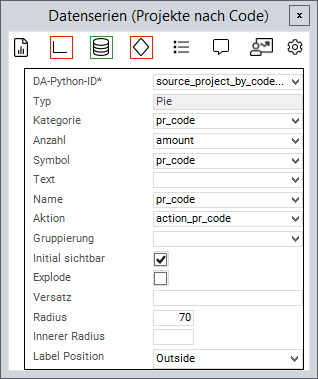
Chart Attributes
Information
An attribute is linked to a value from the source area via the Python ID.
The value of the data field is then further processed.
General Attributes
Attribute | Explanation |
|---|---|
| Python ID of the source data area |
| The chart type in which the data series is to be represented, e.g. |
| Text in the legend |
| Name on the data point |
| Applies the data field color to the data point. Works with traffic lights |
| Defines a data field the action of which will be triggered when the data point is clicked on |
| The values of the series are grouped by the value in this data field |
| When deactivated, the values of this series will not be displayed initially and must be activated via the legend |
| Point on the X-axis at which the data point is to be set |
| Point on the Y-axis at which the data point is to be set |
| ID of the PLANTA symbol which is used to determine the text font. Overrides |
| This parameter is used to configure how 0 values are taken into account and how they are displayed in the chart. Possible settings:
Zero value applies to all chart types except process, risk, and opportunity. |
| Trendline to the corresponding data series. Can be used in all charts with axes. Can currently only be configured in expert mode. Example:
CODE
For further information, please refer to the Syncfusion documentation |
Attributes for Bar/Gantt Charts
Attribute | Explanation |
|---|---|
| If you use the same group name on more than one series, the associated bars/columns are grouped together. For further information: https://blazor.syncfusion.com/documentation/chart/chart-types/column#grouped-column |
| Defines the spacing between the columns in Gantt charts. If the parameter is not set, the spacing is automatically calculated based on the chart size. |
| Defines the width of the columns in Gantt charts. If the parameter is not set, the width is automatically calculated based on the chart size. |
Attributes for Pie Charts
Attribute | Explanation |
|---|---|
| Name of the circular segment |
| Fraction value of the circular segment |
| When activated, the circular segments can be detached and inserted again by clicking |
| Defines how far the circular segments can be detached when |
| Defines the size of the segment radius in percent (in relation to the chart size) |
| Converts the pie chart into a donut diagram by releasing a percentage inside the diagram |
| Configures whether a text field with the number of circular segments is displayed. Possible values: |
| Font size of the label in pixels (default = 12) |
| Defines the action which is effected when the content does not fit in the label. Values: |
| Defines the action which is effected when the content does not fit in the label. Values: |
| Defines the maximum width of the pie chart label. Value: |
Attribute for range charts
Attribute | Explanation |
|---|---|
| The lower value of the data point |
| The upper value of the data point |
Attributes for Scatter Plots
Attribute | Explanation |
|---|---|
| Is used for defining the frame width of the empty rhombs in master milestone status charts (scatter plots). Default is 0 (no frame). Values from 0 provide a frame. |
Attribute for Bubble Charts
Attribute | Explanation |
|---|---|
| Determines the size of the bubble |
| Defines whether the size is to be inverted in bubble data series. When activated, greater values will be represented by smaller bubbles. |
| The minimum radius of a bubble |
| The maximum radius of a bubble |