Open the required user module →Toolsmenu item → Create/edit charts → Open the required chart → Data Series
Information
In this module you can edit the attributes of the data series of a chart.
Depending on the chart type of the opened chart, different data areas will be displayed in the module
Notes
You can only create one data series per pie chart.
Via context menu → Configure series specific marker you can insert a marker configuration in the Marker module which will only be used for the respective data series.
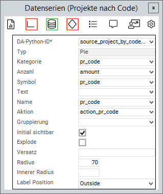
Example
Chart attributes
Information
An attribute is linked to a value from the source area via the Python ID.
The value of the data field is then further processed.
General attributes
Attribute
Explanation
DA Python ID
Python ID of the source data area
Type
The chart type in which the data series is to be represented, e.g. Line or Pie
Name
Text in the legend
Text
Name on the data point
Symbol
Applies the data field color to the data point. Works with traffic lights
Action
Defines a data field the action of which will be triggered when the data point is clicked on
Grouping
The values of the series are grouped by the value in this data field
Initially visible
When deactivated, the values of this series will not be displayed initially and must be activated via the legend
X
Point on the X-axis at which the data point is to be set
Y
Point on the Y-axis at which the data point is to be set
Attributes for pie charts
Attribute
Explanation
Category (X)
Name of the circular segment
Number (Y)
Fraction value of the circular segment
Explode
When activated, the circular segments can be detached and inserted again by clicking
Offset
Defines how far the circular segments can be detached whenExplodeis activated
Radius
Defines the size of the segment radius in percent (in relation to the chart size)
Inner radius
Converts the pie chart into a donut diagram by releasing a percentage inside the diagram
Label position
Configures whether a text field with the number of circular segments is displayed. Possible values:<leer>,Outside,Inside
Attribute for range charts
Attribute
Explanation
Low
The lower value of the data point
High
The upper value of the data point
Attribute for bubble charts
Attribute
Explanation
Size
Determines the size of the bubble
Invert size
Defines whether the size is to be inverted in bubble data series.
When activated, greater values will be represented by smaller bubbles.