
Access
-
Customizer → Chart Customizer → Chart Configurations → Chart Configurations by Work Area → Open required chart →

-
Customizer → Chart Customizer → Chart Configurations → Chart Configurations Direct Editing → Open required chart →
-
Open the required user module → Tools menu item → Create/edit charts → Open required chart →
Information
-
In this module you can edit the attributes of the data series of a chart.
-
Depending on the chart type of the opened chart, different data areas will be displayed in the module
Notes
-
You can only create one data series per pie chart.
-
Via context menu → Configure series specific marker you can insert a marker configuration in the Marker module which will only be used for the respective data series.
Example
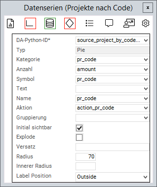
Chart attributes
Information
-
An attribute is linked to a value from the source area via the Python ID.
-
The value of the data field is then further processed.
-
General attributes
|
Attribute |
Explanation |
|---|---|
|
|
Python ID of the source data area |
|
|
The chart type in which the data series is to be represented, e.g. |
|
|
Text in the legend |
|
|
Name on the data point |
|
|
Applies the data field color to the data point. Works with traffic lights |
|
|
Defines a data field the action of which will be triggered when the data point is clicked on |
|
|
The values of the series are grouped by the value in this data field |
|
|
When deactivated, the values of this series will not be displayed initially and must be activated via the legend |
|
|
Point on the X-axis at which the data point is to be set |
|
|
Point on the Y-axis at which the data point is to be set |
|
|
ID of the PLANTA symbol which is used to determine the text font. Overrides |
Attributes for pie charts
|
Attribute |
Explanation |
|---|---|
|
|
Name of the circular segment |
|
|
Fraction value of the circular segment |
|
|
When activated, the circular segments can be detached and inserted again by clicking |
|
|
Defines how far the circular segments can be detached when |
|
|
Defines the size of the segment radius in percent (in relation to the chart size) |
|
|
Converts the pie chart into a donut diagram by releasing a percentage inside the diagram |
|
|
Configures whether a text field with the number of circular segments is displayed. Possible values: |
Attribute for range charts
|
Attribute |
Explanation |
|---|---|
|
|
The lower value of the data point |
|
|
The upper value of the data point |
Attribute for bubble charts
|
Attribute |
Explanation |
|---|---|
|
|
Determines the size of the bubble |
|
|
Defines whether the size is to be inverted in bubble data series. When activated, greater values will be represented by smaller bubbles. |
|
|
The minimum radius of a bubble |
|
|
The maximum radius of a bubble |
- Tutorial: Chart-Customizing
- Tutorial: Chart Customizing
- Chart-Customizer
- Tutorial: Chart Customizing
- Tutorial: Chart Customizing
- Chart-Customizer
- Tutorial: Chart Customizing
- Tutorial: Chart Customizing
- Charts customizen
- Tutorial: Chart Customizing
- Customize Charts
- Tutorial: Chart-Customizing
- Tutorial: Chart Customizing
- Tutorial: Chart-Customizing
- Customize Charts
- Tutorial: Chart-Customizing
- Charts customizen
- Tutorial: Chart-Customizing
- Tutorial: Chart-Customizing
- Chart Customizer
- Chart-Customizer
- Tutorial: Chart-Customizing
- Tutorial: Chart Customizing
- Customize Charts
- Charts customizen
- Charts customizen
- Customize Charts
- Tutorial: Chart-Customizing
- Charts customizen
- Charts customizen
- Tutorial: Chart-Customizing
- Customize Charts
- Charts customizen
- Chart Customizer
- Customize Charts
- Tutorial: Chart Customizing
- Chart Customizer
- Tutorial: Chart-Customizing