
Access
-
Customizer → Layout Objects → Charts → Chart Configurations by Work Area → Click on the link of the required chart to open the Chart Customizer→

-
Customizer → Layout Objects → Charts → Chart Configurations Direct Editing → Click on the link of the required chart to open the Chart Customizer →
-
Open the required user module → Click on the button on a chart to open the Chart Customizer →
For information
-
In this module you can edit the attributes of the data series of a chart.
-
Depending on the chart type of the opened chart, different data areas are displayed in the module
Note
-
The button for opening the Chart Customizer is only displayed to users with customizer rights.
Notes
-
You can only create one data series per pie chart.
-
By right-clicking in the module and selecting the Configure series-specific markers context menu command, you can insert an individual marker configuration in the Marker module which will only be used for the respective data series.
-
By right-clicking in the module and selecting the Edit data points context menu command, you can configure the data points of a data series individually in the Data Points module.
-
By configuring data points individually, the corresponding settings which have possibly been configured in the Data Series module are overwritten.
-
Example
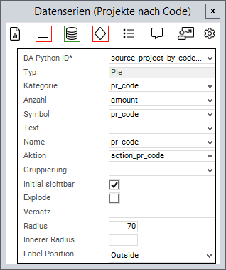
Chart Attributes
Information
-
An attribute is linked to a value from the source area via the Python ID.
-
The value of the data field is then further processed.
-
General Attributes
|
Attribute |
Explanation |
|---|---|
|
|
Python ID of the source data area |
|
|
The chart type in which the data series is to be represented, e.g. |
|
|
Text in the legend |
|
|
Name on the data point |
|
|
Applies the data field color to the data point. Works with traffic lights |
|
|
Defines a data field the action of which will be triggered when the data point is clicked on |
|
|
The values of the series are grouped by the value in this data field |
|
|
When deactivated, the values of this series will not be displayed initially and must be activated via the legend |
|
|
Point on the X-axis at which the data point is to be set |
|
|
Point on the Y-axis at which the data point is to be set |
|
|
ID of the PLANTA symbol which is used to determine the text font. Overrides |
|
|
This parameter is used to configure how 0 values are taken into account and how they are displayed in the chart. Possible settings:
Zero value applies to all chart types except process, risk, and opportunity. |
|
|
Trendline to the corresponding data series. Can be used in all charts with axes. Can currently only be configured in expert mode. Example: For further information, please refer to the Syncfusion documentation |
Attributes for Bar/Gantt Charts
|
Attribute |
Explanation |
|---|---|
|
|
If you use the same group name on more than one series, the associated bars/columns are grouped together. For further information: https://blazor.syncfusion.com/documentation/chart/chart-types/column#grouped-column |
|
|
Defines the spacing between the columns in Gantt charts. If the parameter is not set, the spacing is automatically calculated based on the chart size. |
|
|
Defines the width of the columns in Gantt charts. If the parameter is not set, the width is automatically calculated based on the chart size. |
Attributes for Pie Charts
|
Attribute |
Explanation |
|---|---|
|
|
Name of the circular segment |
|
|
Fraction value of the circular segment |
|
|
When activated, the circular segments can be detached and inserted again by clicking |
|
|
Defines how far the circular segments can be detached when |
|
|
Defines the size of the segment radius in percent (in relation to the chart size) |
|
|
Converts the pie chart into a donut diagram by releasing a percentage inside the diagram |
|
|
Configures whether a text field with the number of circular segments is displayed. Possible values: |
|
|
Font size of the label in pixels (default = 12) |
|
|
Defines the action which is effected when the content does not fit in the label. Values: |
|
|
Defines the action which is effected when the content does not fit in the label. Values: |
|
|
Defines the maximum width of the pie chart label. Value: |
Attribute for range charts
|
Attribute |
Explanation |
|---|---|
|
|
The lower value of the data point |
|
|
The upper value of the data point |
Attributes for Scatter Plots
|
Attribute |
Explanation |
|---|---|
|
|
Is used for defining the frame width of the empty rhombs in master milestone status charts (scatter plots). Default is 0 (no frame). Values from 0 provide a frame. |
Attribute for Bubble Charts
|
Attribute |
Explanation |
|---|---|
|
|
Determines the size of the bubble |
|
|
Defines whether the size is to be inverted in bubble data series. When activated, greater values will be represented by smaller bubbles. |
|
|
The minimum radius of a bubble |
|
|
The maximum radius of a bubble |
- Tutorial: Chart-Customizing
- Tutorial: Chart Customizing
- Chart-Customizer
- Tutorial: Chart Customizing
- Tutorial: Chart Customizing
- Chart-Customizer
- Tutorial: Chart Customizing
- Tutorial: Chart Customizing
- Charts customizen
- Tutorial: Chart Customizing
- Customize Charts
- Tutorial: Chart-Customizing
- Tutorial: Chart Customizing
- Tutorial: Chart-Customizing
- Customize Charts